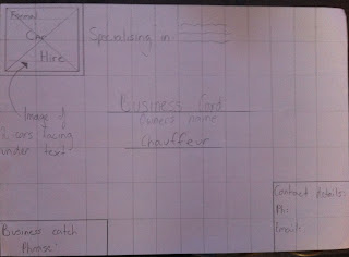
In this assignment wire frames had to be drawn up then have ( in order of appearance on page ) a club newsletter, business card, and a webpage, these are my interpretations of this assignment.
Nathan Jones Portfolio
Thursday, September 8, 2011
Resize images assignment
In this assignment the images had to be changed to 72dpi ( all ) and 900px width for the first two and 400px width for the last image.
Monday, August 22, 2011
Poster design using type
"Worry often gives a small thing a big shadow" - Swedish Proverb.
I chose this quote out of 6 possible ones to use.
I arrived at this design after playing around with different ideas, to me it gave sort of a horror film type of feel which i really liked, the text plays a really big role and the size of the text also plays a really big part of the image,
I chose this quote out of 6 possible ones to use.
I arrived at this design after playing around with different ideas, to me it gave sort of a horror film type of feel which i really liked, the text plays a really big role and the size of the text also plays a really big part of the image,
Sunday, August 21, 2011
Monday, June 27, 2011
Grids
Blue lines representing the grids in this image.
Unfortunately I was unable to find another page layout that did not adhere to a grid in any of my magazines, but this image shows how even thought the use of a grid hasn't been used, it is still effective.

This image uses a grid for the text but for the text position and photos do not adhere to a grid layout.
These 2 images are showing that even if you only have to look as far as the coffee table you can find multiple things that use grids to make viewing easy.
Unfortunately I was unable to find another page layout that did not adhere to a grid in any of my magazines, but this image shows how even thought the use of a grid hasn't been used, it is still effective.

This image uses a grid for the text but for the text position and photos do not adhere to a grid layout.
These 2 images are showing that even if you only have to look as far as the coffee table you can find multiple things that use grids to make viewing easy.
Sunday, May 22, 2011
Subscribe to:
Comments (Atom)


